
These are different Type layouts for my final poster, i've tried changing the type around on a couple of pictures i've chosen that i'm definitely considering for the finished piece.

I like this layout it looks a bit different but the type is covering the image which stops the effect i was going for which is capturing the blast effect.

This is a good layout i like it, it looks like it puts pressure on the image like its trying to hold back the exlosion.

This on of my favourite layouts. It looks similar to the above but the type is more easily read, it has the same effect of holding in the explosion but looks quite sophisticated at the same time which is good because of the type of company the poster is for. The image is bursting with congratulations and excitement for the 100th birthday of GF Smith paper which is the look i was going for.

These images have been darkened, they arent as nice as the others i dont think, the dark doesnt give the right feel to the viewer, it doesnt look like the posters are celebrating because of the tone which is a bit dark and gloomey.


The type on this was distorted when i changed it but is still fairly legible. Not as much as i'd like but the colour of the type is too dark for the image that is already dark, it doesnt stand out as much.

This is a layout that i like a lot. The image is centred and the type is coming from the sculpture down and across the poster, this could resemble two things. Either the sculpture could be a birthday balloon and the type is the string trailing along the ground or the sculpture is the explosion/bom and the type is the fuse coming out ready to explode with congratulations and happy birthdays. The only thing is the type comes from the right so its a little bit confusing to read, i'd want the viewer to look at the poster and straight away see what its all about and get the feel i was trying to get across.

These two images almost look mechanical, i think the type helps this look because i've dropped the shadow and the type is used in that sort of genre e.g Transformers or Terminator. The typeface is Bank gothic, i dont think its the right type to use because of these effects it gives to the image.


These images are a little dark but just enough, i like the typefaces but the way theyre laid out i dont like, they are sophisticated and large enough to be part of the poster but they are laid out too straight. I dont think they flow with the image enough to look like they go together well.


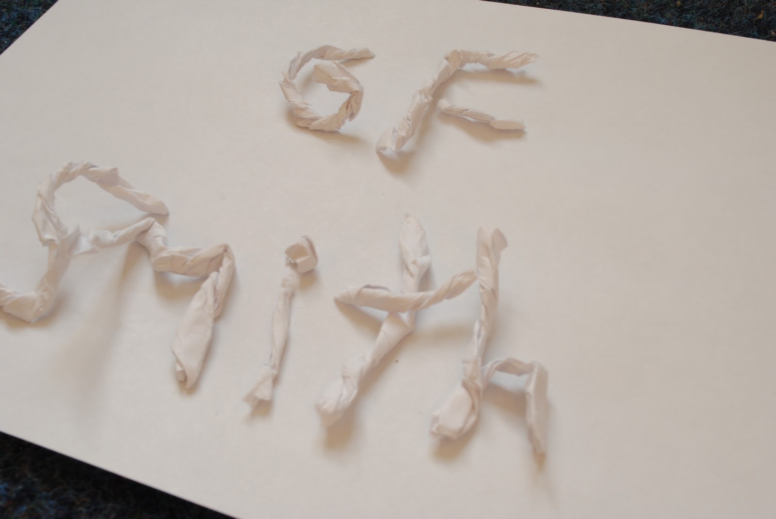
This is some type i made out of my scraps of paper, it gives a nice effect but not for the look im going on my poster, the type needs to be clear and in a smooth layout. This is quirky but a bit too messy and out of shape but it was a cool idea.

No comments:
Post a Comment