I've enjoyed using stop motion and having bit mess around with it, i downloaded the trial version of istopmotion and used it to create these. I liked this motion, it started just chunks getting taken from the apple and you think its over but then you get a face and it becomes real like a character and has facial qualities like a person so is more interesting to watch i think, it has more of a storyline.
Wednesday, 30 March 2011
This experiment was a cupcake wrapper that i've made to fold up gradually i form into a little fat rectangle standing up on its end. I think it has quite 'living like qualities, i walks and seems to get scared when the knife comes in. It shakes a little an moves off quickly. I think stop motion has helped these effects by allowing it to stand up and move on its own.
Stop Motion Tutorial
I made this aeroplane stop motion vid in the session we had. I really enjoyed the session i think i would like to take it further and experiment with it.
Monday, 14 March 2011
Final Poster Design

This is my final poster design. Im very pleased with the end product. The text and image both flow together, i've captured the effect i was going for which was the explosion just before it bursts out, the type helps this by curving across the top as if its part of the image and its going to blow too. The shape of the pyramids i've made it with help this look because the straight edges start together then flow outwards getting bigger to the square bottoms. They start close together in the middle like its the centre of the blast and its exploding outwards. Its similar to party poppers and bangers that explode, i can imagane this popping and the confetti and celebration bursts from within it. I enjoyed this task its very fulfilling at the end to get a clean crisp product.
Type Layouts

These are different Type layouts for my final poster, i've tried changing the type around on a couple of pictures i've chosen that i'm definitely considering for the finished piece.

I like this layout it looks a bit different but the type is covering the image which stops the effect i was going for which is capturing the blast effect.

This is a good layout i like it, it looks like it puts pressure on the image like its trying to hold back the exlosion.

This on of my favourite layouts. It looks similar to the above but the type is more easily read, it has the same effect of holding in the explosion but looks quite sophisticated at the same time which is good because of the type of company the poster is for. The image is bursting with congratulations and excitement for the 100th birthday of GF Smith paper which is the look i was going for.

These images have been darkened, they arent as nice as the others i dont think, the dark doesnt give the right feel to the viewer, it doesnt look like the posters are celebrating because of the tone which is a bit dark and gloomey.


The type on this was distorted when i changed it but is still fairly legible. Not as much as i'd like but the colour of the type is too dark for the image that is already dark, it doesnt stand out as much.

This is a layout that i like a lot. The image is centred and the type is coming from the sculpture down and across the poster, this could resemble two things. Either the sculpture could be a birthday balloon and the type is the string trailing along the ground or the sculpture is the explosion/bom and the type is the fuse coming out ready to explode with congratulations and happy birthdays. The only thing is the type comes from the right so its a little bit confusing to read, i'd want the viewer to look at the poster and straight away see what its all about and get the feel i was trying to get across.

These two images almost look mechanical, i think the type helps this look because i've dropped the shadow and the type is used in that sort of genre e.g Transformers or Terminator. The typeface is Bank gothic, i dont think its the right type to use because of these effects it gives to the image.


These images are a little dark but just enough, i like the typefaces but the way theyre laid out i dont like, they are sophisticated and large enough to be part of the poster but they are laid out too straight. I dont think they flow with the image enough to look like they go together well.


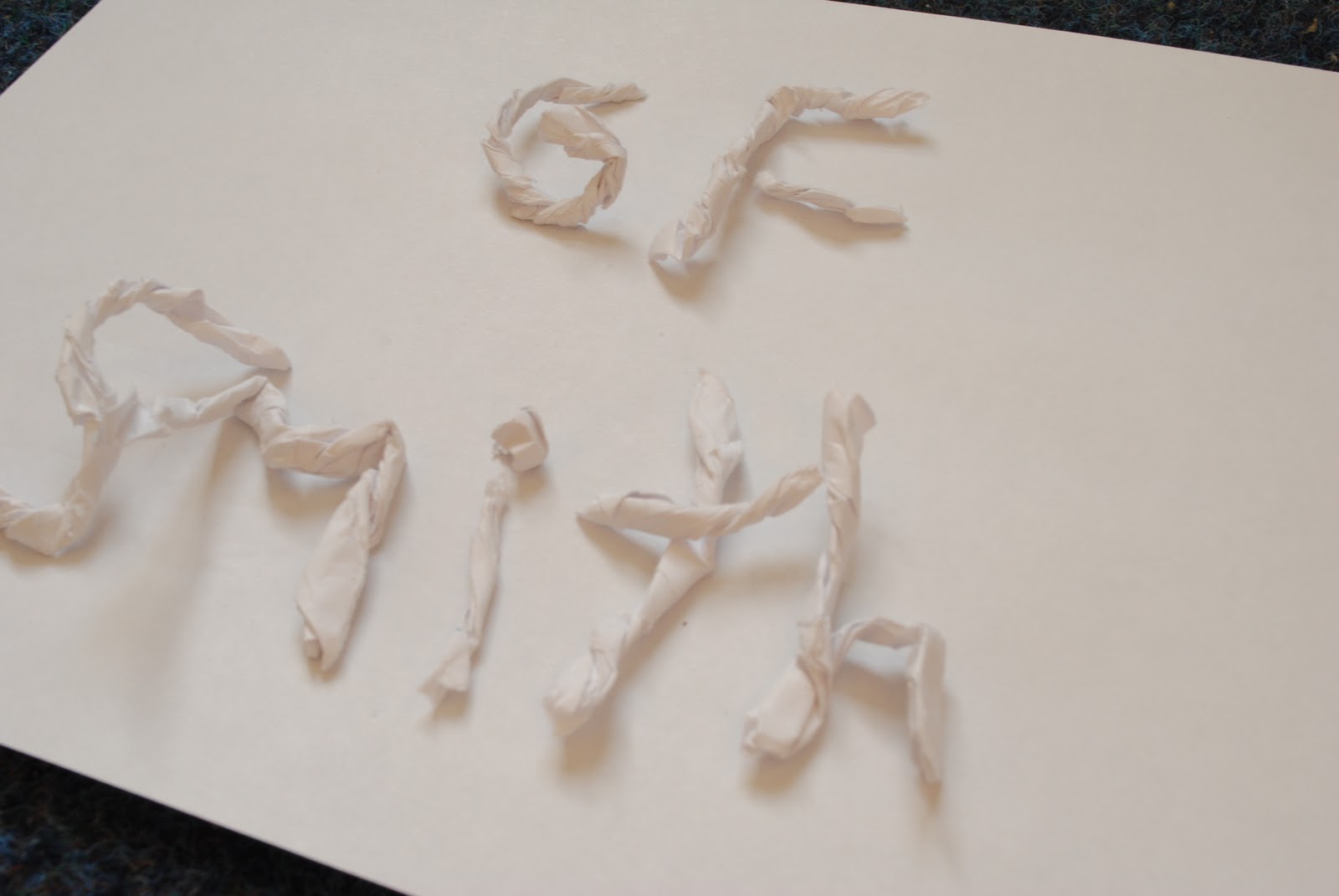
This is some type i made out of my scraps of paper, it gives a nice effect but not for the look im going on my poster, the type needs to be clear and in a smooth layout. This is quirky but a bit too messy and out of shape but it was a cool idea.

Sunday, 13 March 2011
Photographs of my final

I like the pictures that dont show the full sculpture, i think they seem mysterious.


These pictures remind me a bit of quartz, crystal clean and sharp.


I got a lot of influence from certain flowers i looked at also, this flower has the same sort of burst as my piece.


The spherical design of this relates well to mine, it has the same shape and force, i think it looks similar to an atom and the figure of an atom.


The photos in black didnt turn out as well as i'd hoped, it makes the sculpture seem uneven and the shadows bring out the wrong bits of the sculpture that i wanted to make first impact.


This is one out of 3 of contenders for my final poster, its nice and spacious and there is enough room to try different layouts for the type that has to go on.

These atomic explosions under sea give an amazing image, this relates to my sculpture because this picture has also captured the point just before it explodes right out. You can tell theres a lot of pressure in the centre of the explosion, this is the feel i wanted to capture.


This is one of my favourite images, i think this could be a contender for the final piece for the poster. Its really good quality. It especially harnesses the 'just about to blow' feel i was heading for, i think this is because it is so sharp and pristine.
Subscribe to:
Posts (Atom)